Cost of Living in the United States
Data Source & Processing:
The dataset we used for this project is sourced from Kaggle, titled “US Cost of Living Dataset”
(2022). This was pulled from the Economic Policy Institute, a non-profit think tank that
conducts research on the U.S. economy. We selected this dataset because it came from a
reputable source and consolidated an impressively wide range of data, with variables including
state, metropolitan status, area name, county, family member count, and median family income.
Most importantly, this dataset included annual costs of housing, food, transportation,
healthcare, childcare, and taxes.
After retrieving the data from the source, we initiated data processing preceding
visualizations. Our initial step involved selecting columns exclusively featuring monthly
costs by filtering out yearly cost data. For better data extraction in the Javascript
environment, we created a new column containing the full state name instead of state
abbreviations. With all numeric columns formatted as strings, we proceeded to convert them
into float types. For geospatial accuracy in the map visualization, ‘state_id’ column was
created based on the state’s FIPS code.
Since the purpose of our visualization was to discern each state’s cost of living by family
size, we grouped by ‘State’ and ‘Family’ columns. It averaged the cost of living data within
the same state and family size, excluding irrelevant columns like ‘Areaname’ and ‘County’ to
streamline the visualization.
Design Rationale:
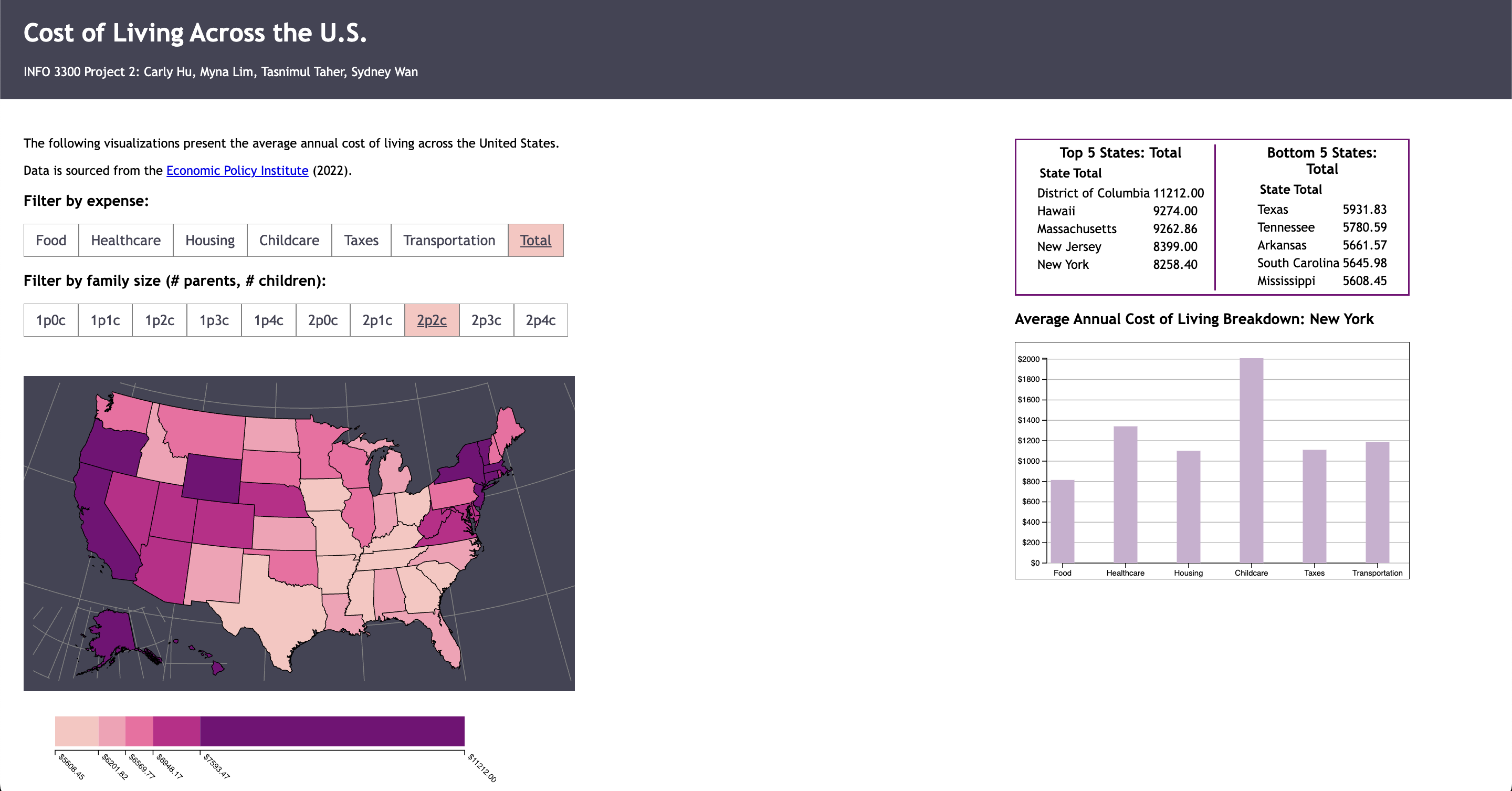
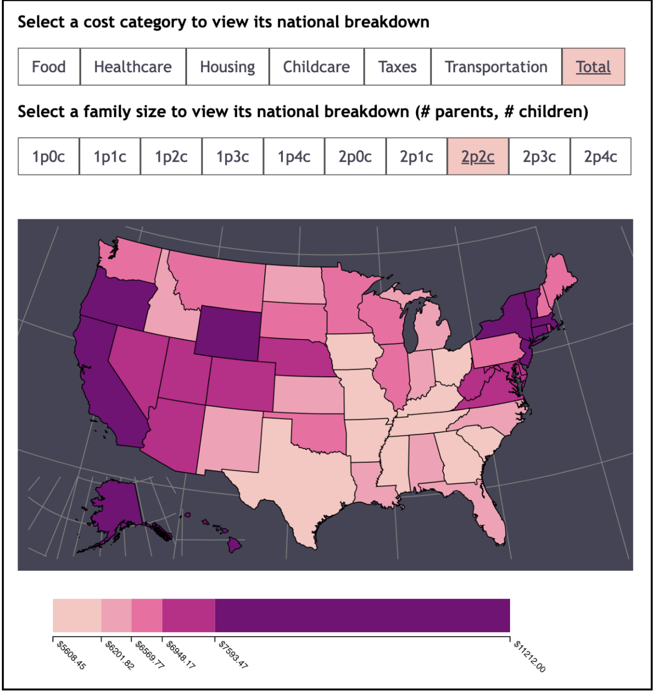
For our first visualization, we decided to create a choropleth map of the United States to
display the variation in different types of living costs, as it would allow users to easily
compare how costly it is to live in each state in terms of different expense types.
- Marks (states) - We decided to use states as the marks for our map (as opposed to counties, which were also available in the dataset). This is because we wanted to tell a story about the variance in cost across the country on the state level—for example, how much more expensive it is to live in New York than in Florida—and felt that visually dividing the data by county could be rather distracting given all of the elements on our dashboard.
- Channels (color) - In setting up the color scale for our map, we chose a sequential scale to represent the cost of living, progressing from a pale pink (low cost) to a dark purple (high cost). This allowed us to effectively communicate the contrast between different cost levels across states for a given cost category or family size.
- Legend - We also added a legend for users to see what cost each state color represents. The size of each of the legend’s quantiles changes dynamically depending on the data that the user seeks to view— changing the state, cost category, or family size will affect the legend. This legend has an axis that is labeled with costs based on the thresholds for the inputted filters.
- Default visualization - A significant part of creating these visualizations was deciding the map's and bar chart's initial state. In terms of the filters, we decided to show the total cost of living (rather than a subcategory such as housing), as this would align with what users might expect from the title, “Cost of Living Across the United States.” We also chose a default family size of two parents and two children, as this is the number of parents and children that most imagine when they think of a typical family. For the bar chart, we chose New York as the default state, simply because we are attending school in New York State.
For our second data element, we created two tables: one that displays the top 5 most expensive
states for a given cost category, and one that displays the bottom 5 least expensive states.
We decided to create this in order for users to have a quick and easy takeaway from our
dashboard without having to select multiple states in order to compare their costs of living.
We ultimately designed this table to be rather minimalistic: the title, “Top 5 States:
[Cost Type]” informs users on exactly what data they are viewing, followed by a list of the
state names and their average cost for that expense.
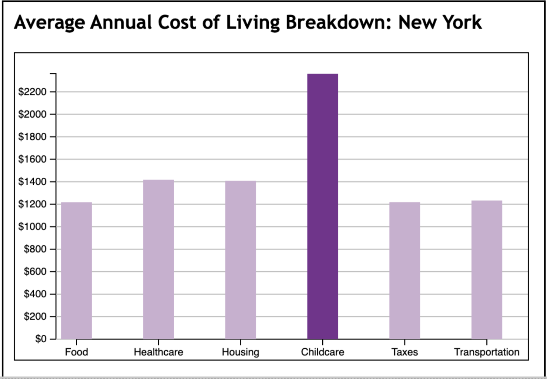
For our third visualization, we implemented a bar chart that displays the breakdown of
expenses for a specific state. The default state is New York, and users can select any state
on the map to view its breakdown.
- Axes: Our design decisions for creating the charts’ axes were rather straightforward. On the x-axis, users see each type of living cost, equally spaced with one corresponding bar for each. The y-axis measures the average annual cost for each expense—it uses a dynamic scale that changes depending on the costs for a given state (ranging from 0 to the highest annual sub-cost for the selected state). These design decisions allow for the chart to effectively communicate how different types of living expenses vary within a state.
- Colors: The main design decision surrounding the colors for this bar chart was to responsively highlight the bar based on the cost category that the user selected— for instance, if the user selects “Healthcare,” the healthcare bar would be dark purple, while all the other bars remain a light purple. This simple design choice allows the user to focus on the expense that they are interested in, while still easily digesting all of the other state information.
Interactivity Elements & Rationale:
Map Filtering
The map was focused around cost type and family size as shown in the buttons on top of the map chart.
- Cost Type: Our selection of cost of living buttons encompasses seven distinct options aligning with our dataset: ‘Food’, ‘Healthcare’, ‘Housing’, ‘Childcare’, ‘Taxes’, ‘Transportation’, and ‘Total’. These options allow users to focus on the statewide distribution of each cost category, allowing for direct comparisons across states. Visualizing the types of cost of living separately provides insights to users on which states exhibit higher or lower expenses in each category. To enhance clarity, a legend bar has been added to visually represent the threshold for all five colors associated with cost. The states’ cost of living ranks are stratified into five groups which are each assigned by different color as depicted on the legend bar. The length of each color segment on the legend bar reflects the magnitude of the threshold gap between groups to provide a clear visual indication of the relative cost levels across states.
- Family Size: Adding another layer of interactivity, we incorporated a family size selection button to include visualization of filtered data based on the specific composition of households. The available family size options include 1p0c, 1p1c, 1p2c, 1p3c, 1p4c, 2p0c, 2p1c, 2p2c, 2p3c, and 2p4c. With these various options, the visualizations dynamically illustrate insights into how various family sizes influence specific aspects of the cost of living. It allows users to easily discern patterns of how changes in the number of parents or children impact the overall cost of living distributions within the states.
Map Hovering
To enhance the user’s interactivity experience, we included additional interactive elements in the map. This allows the user to efficiently depict the state-specific data that they want to view.
- Tooltip: Beyond our map visualization that includes filtering, we incorporated tooltips. These tooltips provide users with state names and specific values of cost of living when hovering over individual states. In maps with small states, it might be challenging for the users to recognize these states' values from a distance. Tooltips allow for more precise information display, ensuring users can focus on specific areas.
- Border thickness: To integrate with the tooltip and accentuate the state being hovered over, we set the state border width as 3. This width effectively emphasizes the user’s focus on the specific state without obscuring its shape with an overly thick border.
Table
Aside from the choropleth map, we introduced a table that dynamically showcases the top 5 and bottom 5 states for each cost of living category and family size. While visualizing the distribution of cost of living ranks across states is useful in and of itself, the inclusion of tables adds a quantitative dimension by presenting specific numerical values. This not only offers users a tangible understanding of the range deemed as high or low in cost of living but also provides an intriguing element where users can identify whether their state falls within top or bottom 5, adding a personalized touch to the exploration of this data.
Bar charts
Along with the tooltip as the interactivity on the map, we included a bar chart of detailed state cost of living when the states are clicked.
- State selection: When the state is getting clicked, a corresponding bar chart will be revealed. It defaults to the total cost of living for New York state with a family size of 2p2c for a convenient starting point. For users desiring a comprehensive view of a state’s cost of living, the bar chart encompasses all cost categories. Regardless of the chosen cost category, users will observe the complete profile of the state’s cost of living, with the selected category distinctly highlighted in a darker shade for enhanced clarity.
- Animated bar charts: For a smooth transition between bar chart visualizations when clicking different states or button options, we incorporated a transition to animate the bars’ appearance. The animation, with a duration of 900 milliseconds, allows the bars to rise smoothly and provide a dynamic representation of different cost of living factors.
The Story:
Through this project, we wanted to tell a comprehensive story about the cost of living in the United States. By allowing users to filter the visualizations by cost category and family size, they are able to “customize” this story to show exactly what they are curious about.
Without selecting any filters, the initial “story” that our visualization tells us is that states with the highest total cost of living are located on the east and west coasts of the country, in states like California, Oregon, New York, New Jersey, and Hawaii— users can confirm this is true by looking at the table to the right, which lists the 5 most expensive US states to live in. New York, the default state used for the state-specific bar chart, has a uniquely high cost of childcare, with its other costs approximately the same save for average food costs.
Utilizing the various filters available to the users, the visualization offers valuable insights into how states vary based on the different living expenses and family sizes. With the cost filters, users can identify patterns indicating that states with high living costs are often clustered together geographically. For example, the healthcare category of the visualization tells us that the Midwest and Southeast regions encompassing South Dakota, Nebraska, Missouri, Illinois, Louisiana, and Mississippi have the highest healthcare cost of living. On the other hand, when focusing on transportation, users can discern that states in the Western regions - Utah, California, Nevada, Colorado, and Wyoming - display the highest cost of living in this category.
Applying family size filters, users can view a dynamic representation of how the cost of living evolves with increasing family size. Comparing the taxes based on the family sizes, users can view that the state ranking of costs changes for each family configuration. For families with 2 parents and 0 children (2p0c), regions such as Montana, Wyoming, and Utah are situated in the middle of the ranking, with average annual taxes totaling less than $573.06. However, as the family size increases to 2 parents and 4 children (2p4c), those same regions rise in the rankings by surpassing $896.74 in taxes.
We acknowledge that this visualization has the potential to include much more information for users. If we were to expand on this project, one of the first additions would be on the bar chart, where we would add functionality that allows users to select multiple states to compare their respective cost breakdowns against each other. Alternatively, it could be helpful to show the national median costs for each category to compare to the selected state. Adding a hover functionality to the bar chart could also be helpful in showing the exact cost values for each bar.