Design and Critique
(link) What Do Men Think It Means To Be A Man?
Source Visualization Critique:
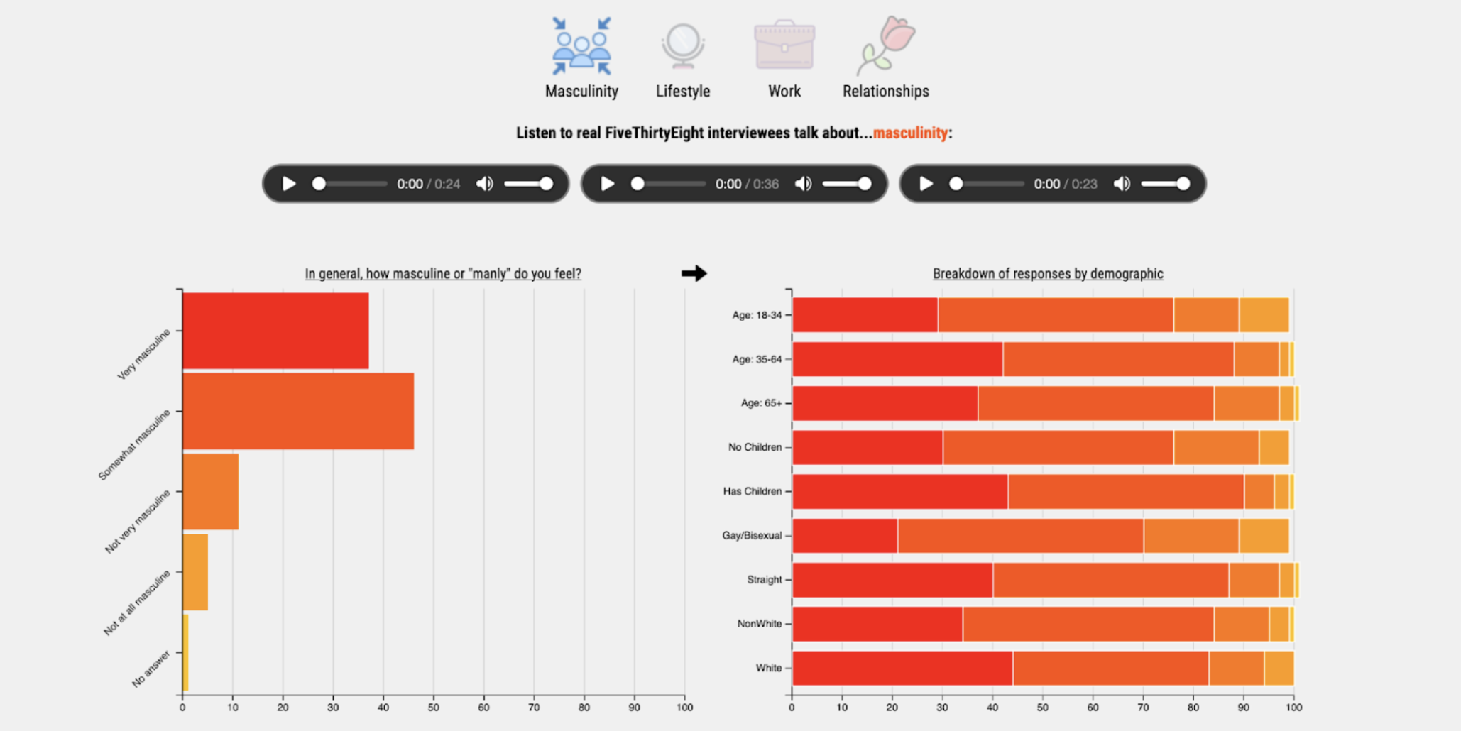
Our source visualizations are from a FiveThirtyEight article titled “What Do Men Think It Means To Be A Man?” by Ella Koeze and Anna Maria Barry-Jester. This set of visualizations pulled its data from a survey of 1,615 adult men conducted by FiveThirtyEight and WNYC Studios in May 2018. Below are three of the six visualizations included in this article.
These visualizations were intended to accompany an article’s paragraphs of both written statistics and direct quotes
collected from the 2018 survey. Thus, instead of creating an engaging, complex visualization that takes time to explore,
the designer’s goal was to give readers quick, concise takeaways as they read through blocks of text. They only utilized
static horizontal aligned bar graphs, only a handful of contrasting colors, and keeps surrounding information to a
minimum. Only one of the six visualizations is segmented by age, which adds one extra dimension of information. As a
result, insights can be easily pulled by readers of all levels of visualization expertise.
Design Rationale
Complete set of survey questions: While exploring the source dataset, we discovered that there was much more useful
data beyond what the FiveThirtyEight article captured. While the authors only visualized answers to six questions,
they had asked a total 25 usable questions in their survey—thus, we decided to create a dynamic bar chart that changes
data based on the selected survey question, which can be browsed through via two arrow buttons.
Categorized data: During our data exploration, we also noticed that the authors’ survey questions were already categorized into four broad categories: masculinity, lifestyle, work, and relationships. To ease the process of cycling through questions, we decided to allow users to filter the data down to a specific category using playful icons. Each time an icon is clicked, users have access to a new set of questions. Categorized data: During our data exploration, we also noticed that the authors’ survey questions were already categorized into four broad categories: masculinity, lifestyle, work, and relationships. To ease the process of cycling through questions, we decided to allow users to filter the data down to a specific category using playful icons. Each time an icon is clicked, users have access to a new set of questions.
Podcast audios: The authors also embedded WNYC’s 40-minute “Death Sex & Money” podcast within their article, in which men were interviewed on their thoughts on masculinity. We thought that this podcast provided valuable context to the quantitative data, so we decided to insert audio clips from the podcast for each of the four interview categories. These audios change based on the selected category.